Evidence or Chance: What the Heck is Hypothesis Testing? (Part 1) 🤔📊
Let's also understand how the 'Halo Effect' can influence our perception and how to find outliers in data.
Hello, data enthusiasts and curious minds!
Welcome to the 9th edition of DataPulse Weekly, where we unravel the magic behind data and its impact on our daily lives.
Each newsletter promises to be a journey through the fascinating intersections of data, stories, and human experiences. Whether you're an analyst, data scientist, or simply curious about how data shapes our world, you're in the right place.
Before we dive into today’s newsletter, let's all agree that we still scratch our heads when we hear 'Hypothesis Testing'. So a word of caution: this newsletter might be a bit dense, but rest assured, like every newsletter, we will break it down in an easy-to-understand manner. This is part 1 of our series on hypothesis testing, and we will cover part 2 in our next edition.
Let’s dive straight into today’s Data Menu!
Today’s Data Menu
Data Case Study: Hypothesis Testing (Part 1)
Metric: Standard Deviation
Human Bias Focus: Halo Effect
Data Nugget: Outlier Detection
Data Case Study: Hypothesis Testing (Part 1)
WebInnovate, a hypothetical tech company, revamped its website hoping that the new design would engage visitors for longer periods. They chose the average time spent on the site as the main KPI (Key Performance Indicator) to evaluate the effectiveness of their website design.
They sampled 100 users and observed that the new average time spent was 3.3 minutes, compared to the previous average of 3 minutes. That’s a 10% improvement over the previous average—a significant improvement, indeed.
Should they conclude that the new design has indeed improved the average time and continue with the new design in the future?
And as always, we have a statistical method at our rescue—Hypothesis Testing!
Yes, we're puzzling over this as we write, but bear with us for a few more minutes as we delve deeper into hypothesis testing.
So, what exactly is hypothesis testing?
Simply put, it is a method to determine whether there is sufficient evidence in newly observed sample data to conclude that a new value for a given KPI will hold true for the entire population and that the new observation is not just by pure chance, luck, or coincidence.
Read that again! Yes, take a moment and really absorb that statement!
Keep in mind these five phrases: Entire Population, KPI Value, New Sample Data, Sufficient Evidence, and Chance.
Here’s another way to think about Hypothesis Testing in our example context:
You've always known that people spend about 3 minutes on your website. Now, with the new website design, they're spending 3.3 minutes. If it turns out that such an increase is very rare, or in other words, if the chance of this happening by itself is extremely low, then you can be pretty sure that your new design is actually making a difference, and it's not just a fluke.
Alternatively,
Consider that you only have past historical data (the Entire Population) showing how long people usually spend on your website (the KPI Value). Now, if it turns out that the likelihood of seeing the new average time (3.3 minutes) is really, really low, you can confidently say that your new website design is indeed making a significant difference (Enough Evidence) and that this improvement isn't just happening by chance.
At this moment, you are either fully engaged or ready to move to the next section of this newsletter, and we definitely understand that. Please hold on for a few more minutes.
Hypothesis Testing is to assess whether the observed data significantly deviates from what is expected under the Null Hypothesis.
Wait, what’s the Null Hypothesis?
Every Hypothesis Testing starts with 2 hypotheses - the first step in every Hypothesis Testing:
Null Hypothesis (H₀): There is no effect or difference. Whatever has happened in the past is still happening. In our case, H₀ will be: The new design does not change the average time spent on the site; the average time remains 3 minutes.
Alternative Hypothesis (H₁): This claims that our new sample observation indeed shows a difference from the status quo. In our case, H₁ will be: The new design increases the average time spent on the site, so the average time is greater than 3 minutes.
Hypothesis Testing can lead to one of these two outcomes:
We reject the Null Hypothesis and lend support to the Alternative Hypothesis, given sufficient evidence in favor of H₁.
We fail to reject the Null Hypothesis, not due to affirmative evidence for it, but because of insufficient evidence to support H₁. It's important to note that failing to reject the Null Hypothesis does not equate to accepting it. That’s a topic for another day.
Now, you might wonder, what determines which of these conclusions we reach?
This is where statistics becomes interesting and, at the same time, daunting. Statistics usually works with confidence and risk.
So, the question here is - what’s the risk that we can afford while supporting the Alternative Hypothesis?
Can we say 50%? Oh, that’s a huge risk. 20%? That’s still a significant risk, but would I want to change my design with that much risk? Probably, yes. But in another world, would I like to risk a new diagnosis with that much risk, Heck No!
So, how much risk am I okay to take? As a rule of thumb, it is often taken as 5% as that can probably work in most situations. And, is there a term for that as well in statistics? Yes, that’s significance level for you.
The level of significance is the probability that the result reported happened by chance.
How much chance do we want to take? 5%? That’s absolutely right!
In other words, the significance level also sets the threshold for when an effect is considered statistically significant, beyond just assessing risk acceptance.
So for now, if we can calculate the probability of observing an average time as extreme as 3.3 minutes under the assumption that the Null Hypothesis is true, we are sorted. If this probability is less than our significance level, it indicates that there is a very low risk in supporting our alternative hypothesis, which states: 'The new design increases the average time spent on the site, so the average time is greater than 3 minutes.’
Is there a term for that as well in statistics? Oh yes, That’s the p-value. Guess what 'p' stands for here, yes, you guessed it right, that’s probability.
The p-value is the probability of observing results as extreme as ours (or more so) if nothing has actually changed or if there is truly no effect. It measures how unusual our results are under the assumption that the null hypothesis is correct.
If our p-value is less than 0.05, we reject the Null Hypothesis and if it is greater than 0.05, then we fail to reject the Null Hypothesis.
That wraps up Part 1 of Hypothesis Testing. In the next segment, we'll continue with the same example and build on what we've already covered. We'll assume a standard deviation of 0.8 minutes for our new sample data and use a t-test. Feel free to leave a comment if you have insights on what our conclusions should be.
This sets the perfect stage for our next section.
Metric of the Week: Standard Deviation
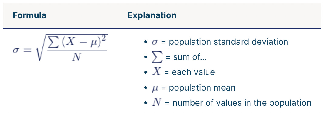
In simpler terms, the standard deviation, often represented as σ and pronounced as 'sigma,' measures the spread of data around its mean value.
A more technical definition: Standard deviation is a statistical measure that quantifies the amount of variation or dispersion in a set of data values. A low standard deviation indicates that the data points tend to be close to the mean (also called the expected value) of the set, while a high standard deviation indicates that the data points are spread out over a wider range of values.
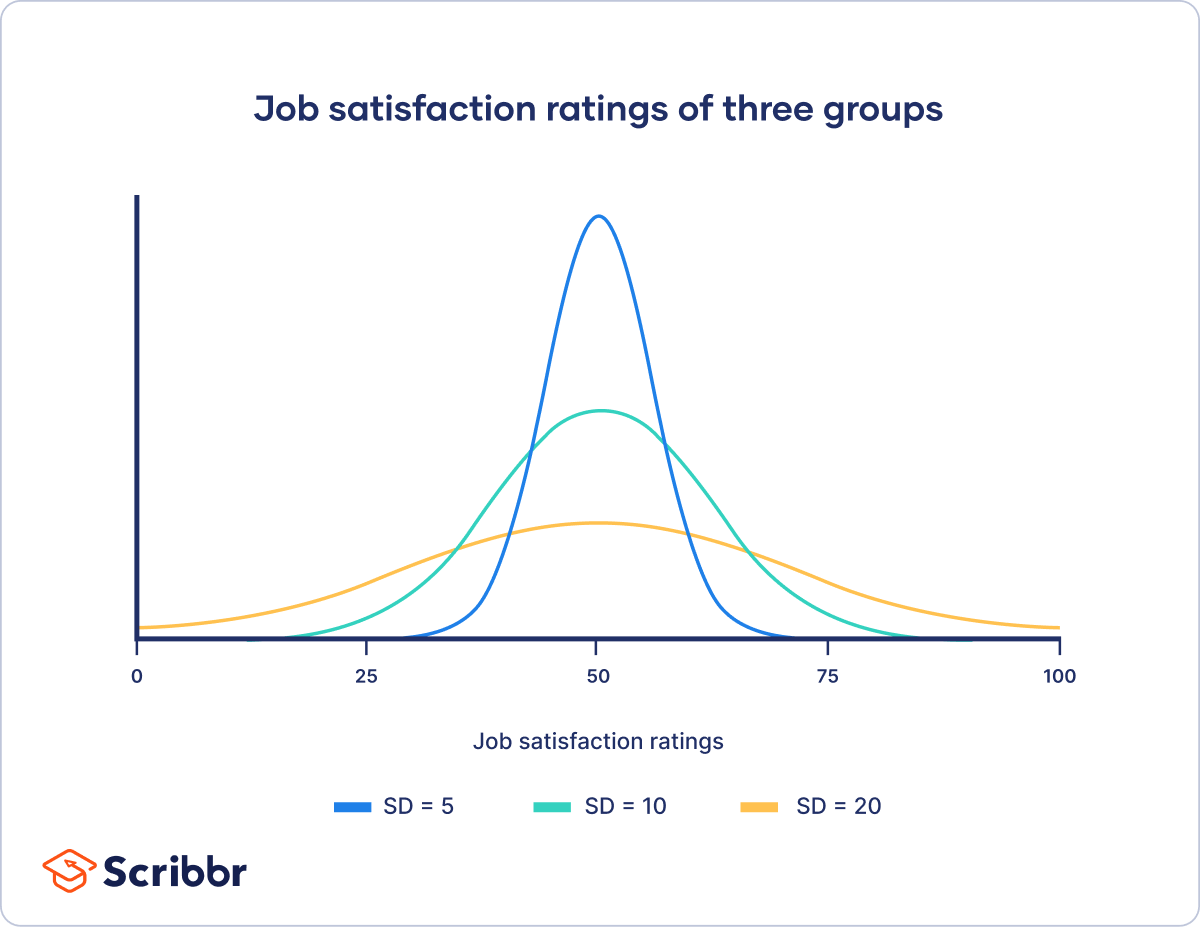
Below are examples demonstrating data with varying standard deviations. Understanding this graph should be sufficient for this section. As you can see, a low standard deviation (10) is much more compact, while a high standard deviation (20) is flattened.
Formula: The standard deviation (σ) is calculated as the square root of the variance, which is the average of the squared differences from the mean.
Application: Standard deviation helps in understanding how data is spread. For instance:
Low Standard Deviation Example: Daily temperatures in a tropical city vary between 28°C and 32°C, indicating a tight clustering typical of a normal distribution.
High Standard Deviation Example: Stock prices during a volatile period, ranging from $10 to $200 in a month, show a widespread, illustrating significant deviation from a normal distribution.
Understanding standard deviation is crucial for assessing the reliability and variability of data, making it essential for informed decision-making in any analytical context.
💡 Remember that building a data mindset is effective only when we focus on solving data-related problems. The below question is designed for exactly this kind of practice. We will address this in the last section of this newsletter.
Food for thought:
You have been tasked with analyzing delivery times for an e-commerce company. The data will be used to perform descriptive analytics and test hypotheses concerning average delivery times. Although most orders are delivered within three days, you have observed some extreme cases where delivery takes as long as 20 days. How would you ensure that such extreme observations do not influence your analysis?
Human Bias Focus: Halo Effect
Did you know there are more than 180 ways your brain can trick you? These tricks, called cognitive biases, can negatively impact the way humans process information, think critically and perceive reality. They can even change how we see the world. In this section, we'll talk about one of these biases and show you how it pops up in everyday life.
Mia, a data analyst, is set to present a report on her company's recent performance to management. She has three critical data points to discuss and two potential orders for her presentation:
Approach 1:
MoM (month-over-month) customer retention rate has increased by 10 percentage points in the last month.
NPS has remained flat.
User growth decreased by 5% in the past month due to the absence of major campaigns.
Approach 2:
User growth decreased by 5% in the past month due to the absence of major campaigns.
NPS has remained flat.
MoM customer retention rate has increased by 10 percentage points in the last month.
Which approach should Mia use to present her analysis?
While both approaches cover the same data points, if you're like most people, you might find Approach 1 less daunting, while Approach 2 could highlight immediate areas of concern for the business.
This is the 'Halo Effect' at work.
The Halo Effect occurs when initial positive aspects or impressions about something can influence our perception of the whole, sometimes causing us to overlook other characteristics.
In this scenario, the order in which Mia presents the information can significantly influence management’s perception of the overall performance. Starting with positive data might cast a 'halo' over the negatives, leading to a more positive overall impression of the company's performance. Conversely, leading with the negatives could emphasize the issues, making them the key highlight.
Understanding the 'Halo Effect' can enhance storytelling skills not just for data analysts but in all areas of life, be it a presentation or your introduction.
Other examples of the ‘Halo Effect’ in action:
Apple's New Product Launches: Any new product launched by Apple benefits from the 'Halo Effect' due to the brand's strong reputation. Loyal Apple users often perceive new products favorably based on positive experiences with previous offerings.
Celebrity Endorsements: If a favorite celebrity endorses a product, consumers are likely to have a positive perception of it, potentially overlooking other product features or competitors' offerings.
Remember, recognizing any bias is the first step to overcoming its impact on our decision-making.
This brings us to our last section where we address the questions asked earlier.
Data Nugget: Outlier Detection
Diving into our previous question, how would you ensure that extreme delivery times in your data do not influence your analysis?
We can understand this better through outliers.
What are outliers?
Simply put, outliers are extreme values that are significantly different from most observations in the dataset. Outliers can be of two types: naturally occurring outliers and outliers due to data collection errors.
There are two popular methods to identify outliers:
Using Z-Score: This method is applicable when the data follows a normal distribution. A Z-score, also known as a standard score, calculates the deviation of a data point from the mean. Typically, any score above +3 or below -3 is considered an outlier.
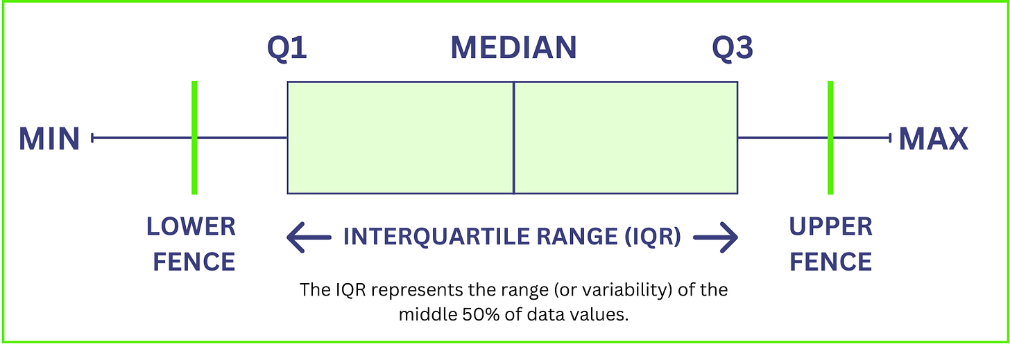
Interquartile Range (IQR): Outliers can significantly skew data analysis results. The IQR is an effective method for identifying and managing these outliers, calculated as the difference between the 75th percentile (Q3) and the 25th percentile (Q1). This range represents the middle 50% of the data, providing a measure of statistical dispersion.
Steps for Outlier Detection Using IQR:
Calculate the IQR: Subtract Q1 from Q3.
Determine the boundaries: The lower boundary is set at Q1 - 1.5 * IQR, and the upper boundary at Q3 + 1.5 * IQR.
Identify outliers: Data points falling outside these boundaries are considered outliers.
You can either remove them or cap them at the nearest boundary value, depending on your analysis needs.
Utilizing Outlier Identification methods helps in minimizing the impact of outliers on data interpretation, ensuring that your insights are driven by true patterns and not by anomalies. This approach is particularly valuable in large datasets where the integrity of data affects the overall outcome.
That concludes today’s newsletter! We’ve simplified complex data concepts and will continue to do so in upcoming editions. Crafting these explanations in a straightforward manner takes considerable effort. If you found this newsletter beneficial, please consider subscribing and sharing it with others who might also gain from it. Your support motivates us to go above and beyond in creating even more valuable content for you.


Hypothesis testing is not an easy topic to understand in one go. I like how you have tackled the topic and simplified it for the readers. Good read!