An Intuitive Explanation of K-means Clustering 📊
Decoding the K-means Algorithm and Avoiding Clustering Illusion
Hello, data-driven and curious minds, welcome to the 21st edition of DataPulse Weekly!
Each newsletter promises a journey through the fascinating intersections of data, stories, and human experiences. Whether you're an analyst or simply curious about how data shapes our world, you're in the right place.
Now, let’s dive straight into today’s Data Menu -
Today’s Data Menu 🍲
📊 Case Study: K-means Clustering
🧠 Cognitive Bias: Clustering Illusion
📊 Case Study: K-means Clustering
Have you ever wondered why we create music playlists, make separate photo albums, use kitchen organizers, and build user personas for a business?
It's simple—grouping similar items together makes it easier to process information and tailor actions.
Let’s look at these examples:
Companies tailor their marketing campaigns based on user personas.
Similar products in a grocery order get delivered in the same package.
Banks offer a variety of financial products based on risk profiling
Grouping similar items together not only streamlines processes but also enhances efficiency and personalization.
This is where clustering comes into play, with K-means being one of the most popular unsupervised machine learning techniques for creating clusters from provided data. Unsupervised learning is a method where the machine identifies patterns and groupings in data without predefined labels or categories.
To perform effective clustering, we need to address two key questions:
How many clusters are optimal for the data?
Which cluster does each data point belong to?
Getting the right number of clusters is crucial:
Too many clusters can lead to decision fatigue and operational inefficiency.
Too few clusters can limit understanding and hinder tailored actions.
Consider the following example -
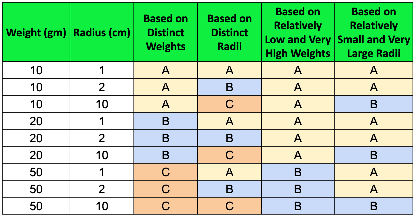
We have a set of rounded balls with the sample data shown below. Take a moment to think about this: how many clusters would be optimal for this data, and which cluster should each data point belong to?
If you are like most of us, you might end up creating one of these four clusters:
Now, how can we determine the most accurate clustering or if better clusters exist? Stay tuned, as we'll answer this at the end of the section!
First, let’s address the question:
How many clusters are optimal for the data?
The optimal number of clusters can depend on context and requirements, but there are techniques to identify it. Two popular methods are the Elbow Method and the Silhouette Method.
Determining the Optimal Number of Clusters
The Elbow Method involves plotting the sum of squared distances (inertia) from each point to its assigned centroid for different values of k and identifying the "elbow" point where the rate of decrease in inertia significantly slows down.
Let’s break down the key terminologies -
A centroid is a central point of a cluster, initially chosen randomly, and it represents the average position of all data points within that cluster.
The elbow point indicates the optimal number of clusters where adding more clusters doesn't significantly reduce the sum of squared distances (inertia).
Intuitively, inertia quantifies how tightly the data points are grouped around their centroids. Lower inertia indicates that data points are closely clustered together, suggesting that the clusters are compact and well-defined. Higher inertia means that data points are more spread out, indicating that the clusters are less cohesive.
Essentially, inertia helps us assess the quality of the clustering: lower inertia values suggest better-defined and more meaningful clusters.
The formula for inertia is:
Here's an example graph illustrating the Elbow Method:
As we can see, as the number of clusters (k) increases, inertia keeps decreasing. However, after a certain number of clusters, the decrease in inertia becomes negligible.
The graph shows a clear elbow at k = 4, indicating the point where adding more clusters does not significantly reduce inertia, suggesting that 4 clusters are the optimal choice for this data.
The Silhouette Method offers another effective approach by measuring how similar a point is to its own cluster compared to other clusters. Learn more about it here.
Now that we know how to identify the optimal number of clusters, let’s understand the K-means algorithm and how it works.
K-means Algorithm
K-means is a clustering algorithm that aims to partition data points into k clusters, where each data point belongs to the cluster with the closest centroid.
Here’s how the algorithm works:
Initialization: Choose k initial centroids randomly from the data points.
Assignment: Assign each data point to the nearest centroid using Euclidean distance. The Euclidean distance between two points (x1, y1) and (x2, y2) is calculated as:
This distance metric ensures that each point is assigned to the cluster with the nearest centroid.
Update: Calculate the new centroids by taking the mean of all data points assigned to each centroid.
Repeat: Repeat the assignment and update steps until the centroids no longer change or the change is minimal.
Here is the algorithm in action:
Quite intuitive, isn't it? (We recommend checking this out on an app or website.)
Explore more fun visualizations that demonstrate how the algorithm works in real-time:
K-means Visualization by Shabal: This visualization starts with four random points and keeps updating the centroids to minimize the distance between points and centroids to reduce inertia.
K-means Visualization by Naftali Harris: This tool allows you to input the number of clusters and different types of data.
Key Things to Remember
Normalization: Essential in K-means clustering to ensure all features contribute equally to the distance calculations. Without normalization, features with larger ranges can dominate, leading to biased results.
Handling Categorical Variables: Convert categories into numerical values using techniques like one-hot encoding to allow K-means to process categorical data effectively.
Dealing with Outliers: Outliers can significantly impact clustering results. Detect and handle outliers appropriately.
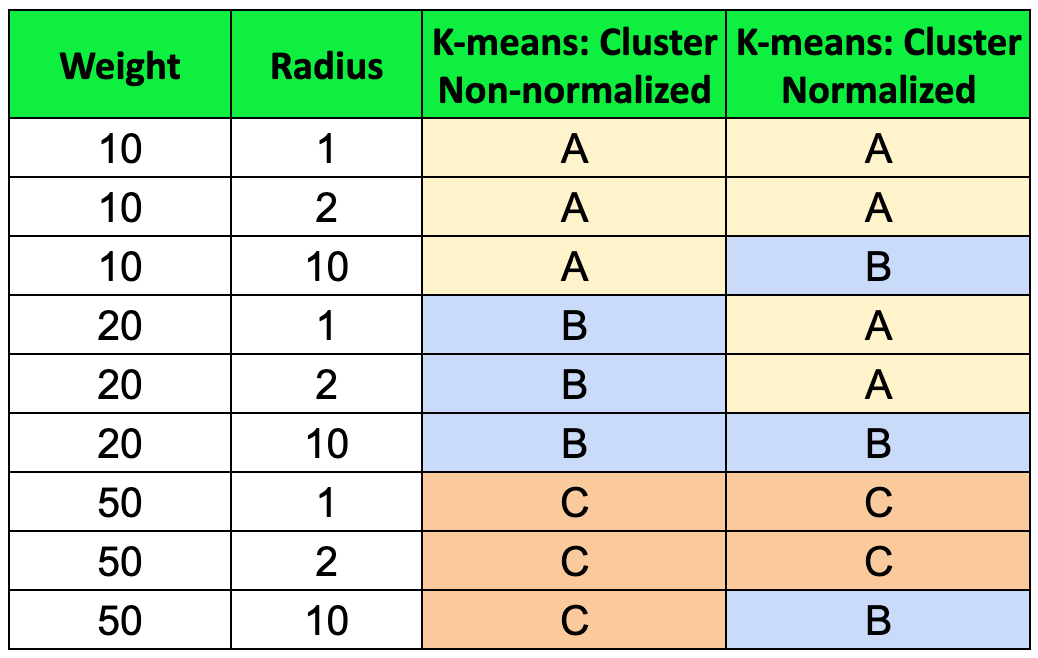
Now, returning to our original dataset, when we pass the data through the K-means algorithm, this is what we obtain:
Non-normalized data was biased towards the ‘Weight’ variable due to its higher magnitude compared to the ‘radius’, emphasizing the importance of normalizing data before applying K-means clustering.
After normalizing, we identified three clusters in the last column:
(A) Balls with low weights, excluding large-radius balls.
(B) Balls with a large radius of 10 cm.
(C) Balls with high weights, excluding large-radius balls.
While humans can identify patterns to a certain extent, K-means and other clustering techniques excel at detecting non-obvious patterns in data. This algorithm can handle multi-dimensional data and accurately identify the optimal clusters, providing deeper insights and more precise groupings.
Conclusion
Clustering helps us make sense of data by grouping items based on common properties. The applications of clustering include customer segmentation, enhancing operational efficiency, grouping items, enabling personalized actions, and more. K-means clustering minimizes the distance of points from the centroid, making it an intuitive method for identifying clusters. It can be easily implemented using Python or other tools.
Understanding clustering is crucial, but it's equally important to recognize a closely related cognitive bias: the clustering illusion.
🧠 Cognitive Bias: Clustering illusion
Did you know there are more than 180 ways your brain can trick you? These tricks, called cognitive biases, can negatively impact the way humans process information, think critically and perceive reality. They can even change how we see the world. In this section, we'll talk about one of these biases and show you how it pops up in everyday life.
Imagine you are traveling through the streets and notice a pattern in the clouds: a heart-shaped cloud with an arrow going through it. You start feeling that this pattern means something significant or that it appeared for a specific reason.
This is a classic example of the clustering illusion.
What is a Clustering Illusion?
The clustering illusion is a cognitive bias where people perceive patterns or clusters in random data. This bias occurs because our brains are wired to find order and meaning, even in random or chaotic environments. The clustering illusion leads us to see groupings or patterns that don't actually exist.
Other Examples Include:
Stock Market Pattern: Investors might see trends or clusters in stock price movements and believe they can predict future performance. However, these perceived patterns may just be random fluctuations, leading to misguided investment decisions.
Seeing Random Patterns in Data Analysis: If we observe high engagement for Instagram posts at 10 AM on three consecutive Mondays, we might think this is the best time to post, but it could be coincidental and not a reliable pattern.
The Monte Carlo Casino Example: During a game of roulette in 1913 at the Monte Carlo Casino, the ball landed on black 26 times in a row. The chance of hitting a black ball in a game of roulette is 47.4%. Therefore, the probability of the ball landing on black 26 times in a row was roughly 1 in 67 million. Many gamblers fell prey to the clustering illusion, betting heavily on red, believing a red outcome was "due."
Tell us in the comments if you know of any clustering illusion.
People often perceive random patterns to make sense of chaos. While patterns can help us interpret data, seeing a heart-shaped cloud doesn't necessarily mean you're in love.
How to Avoid Clustering Illusion
Use Statistical Analysis: Ensure patterns are statistically significant, not just apparent.
Increase Sample Size: Larger samples reduce random variations.
Seek Peer Review: Collaborate for fresh perspectives and bias checks.
Recognizing and addressing the clustering illusion helps us make accurate decisions and avoid mistaking random patterns for meaningful trends.
That wraps up our newsletter for today! If you found this valuable, please consider subscribing and sharing it with a friend—it motivates us to create more content. Next time you need to make sense of a vast amount of data, remember how K-means clustering can help. And beware of the clustering illusion when someone tries to find patterns that don't exist.
Stay curious and connected!
Until next Tuesday!
Recommended Next Read:


